Restoring A Mid Century Modern Architectual Masterpiece in Southern California
The Philmer J. Ellerbroek Residence
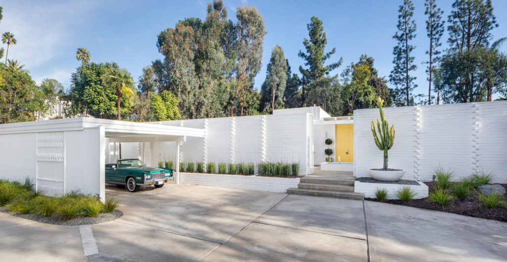
Nestled in the serene Orange County foothills of Tustin, is this beautifully designed mid century modern home and the original residence of renowned California Modernism architect, Philmer J. Ellerbroeck. We were honored to be chosen by the new owners of the residence to delicately restore and furnish this architecturally significant and important home in Southern California. Ellerbroeck designed the home for his family in 1961 and lived there with his family until his death in 1969. It has gone through a few owners since then, but was recently purchased by our clients, Casey Lesher and Thomas Fountain. Casey and Tom were already clients of The Modern Vault and had purchased many items from us in the past. When they came to us to ask for our assistance with their dream home, we couldn’t say ‘YES PLEASE’ fast enough.
Careful planning and research are crucial with such an important landmark
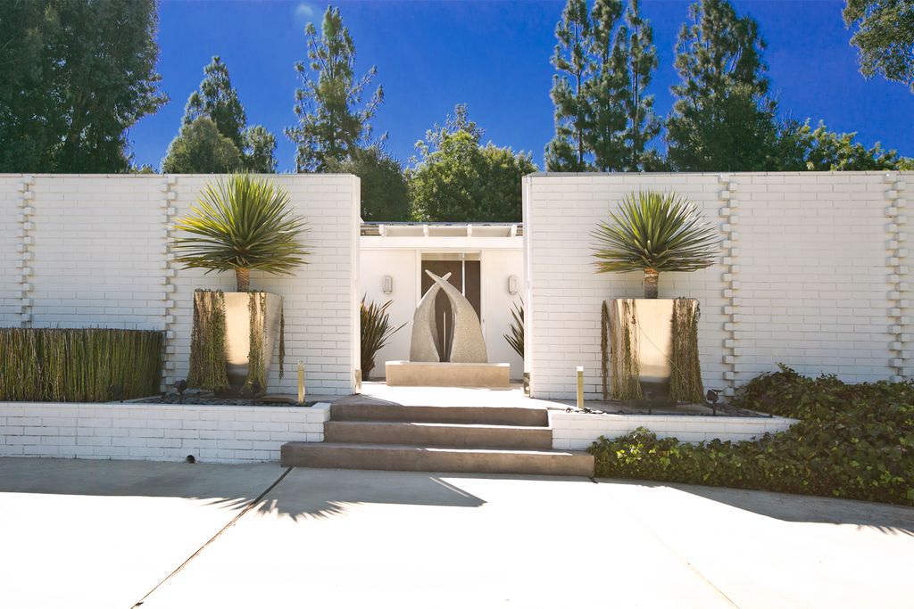
Unfortunately, many of the mid century modern homes in the area have been destroyed or demolished by their new owners and only a few remain untouched, but Casey and Tom were insistent that the home be brought back to its original glory from several previous and not-so-appealing nor period correct changes. In keeping with the architects original design, we were able to find a few photos of the original home, before any changes were made and stuck to the original theme as much as possible and within budget. This was crucial to the process and the end result is quite stunning.
“I’ve been dreaming about owning this home for 30 years and my dream has come true…”
Casey Lesher, Owner
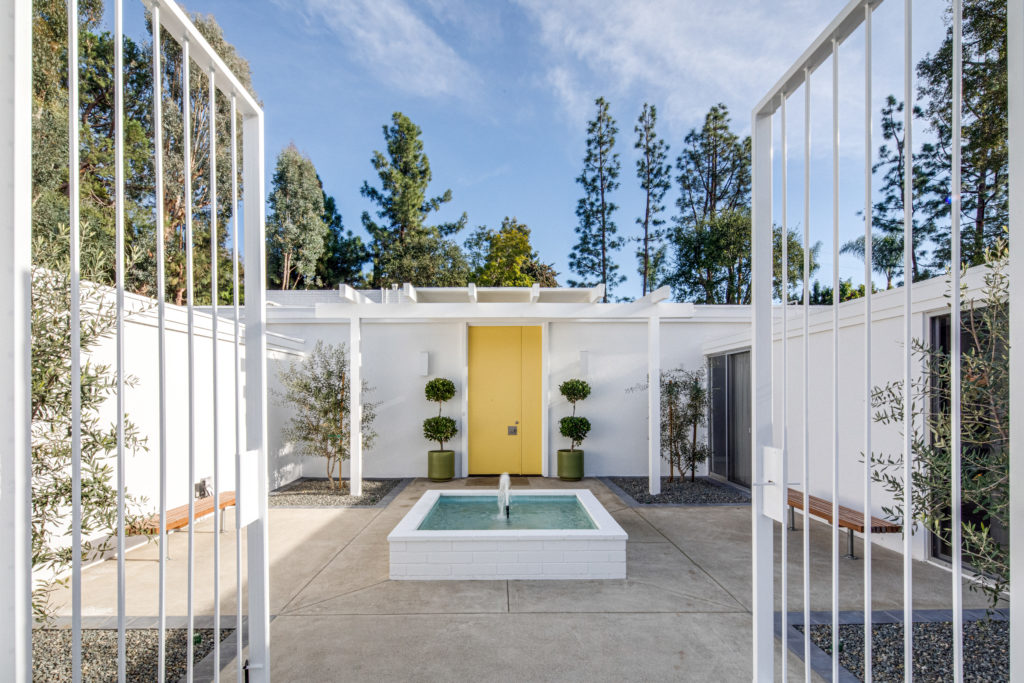
You never get a second chance to make a first impression
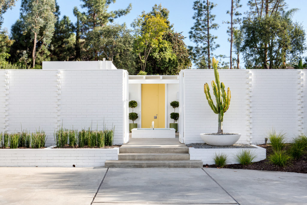
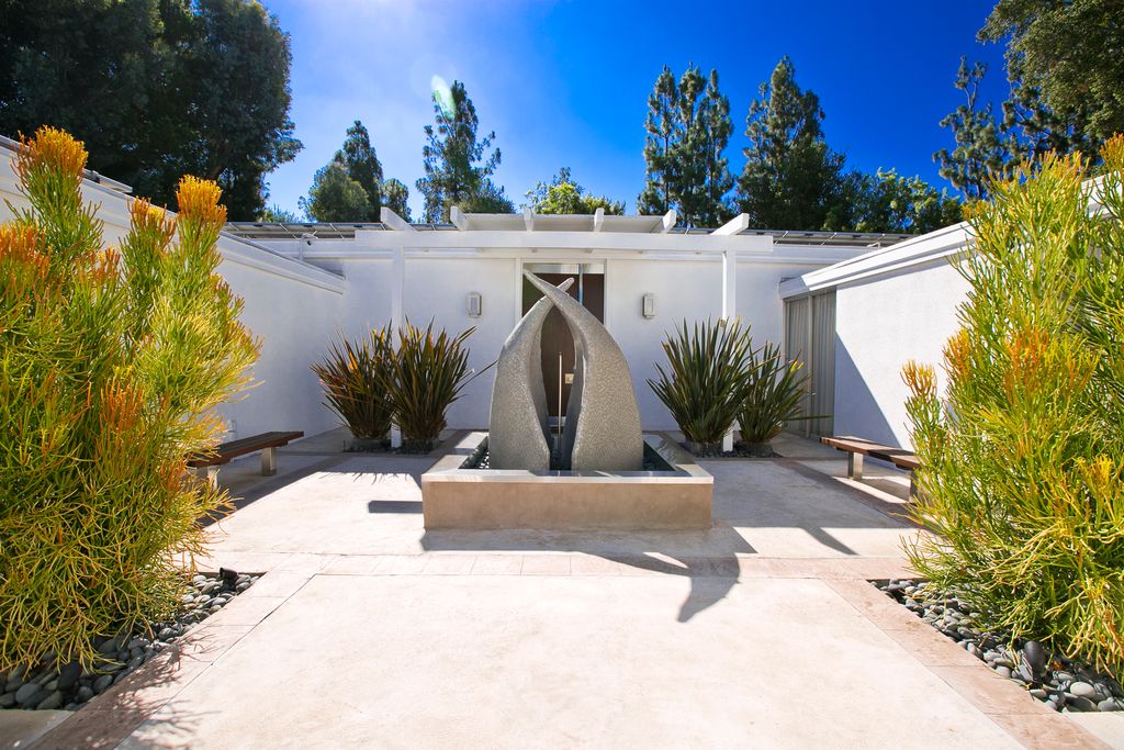
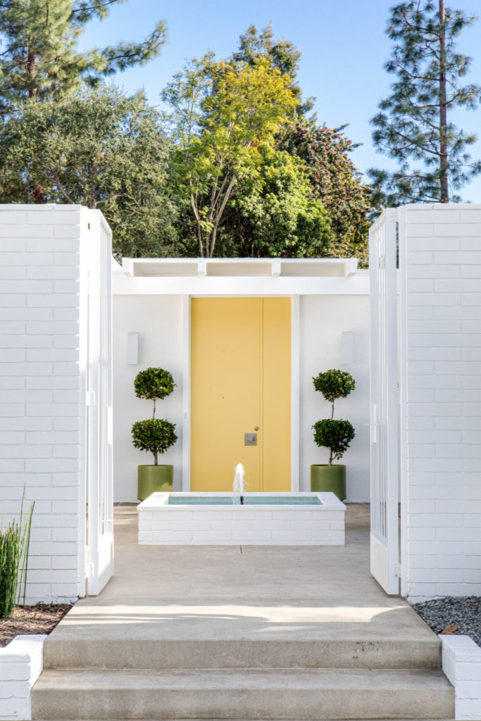
The updated entry makes a memorable first impression. As you walk into the entry and courtyard, the soft yellow door greets you with an inviting welcome. The beautiful 12′ tall Saguaro cactus you see at the right of the staircase entry was hidden away in the backyard and was relocated to the front of the home. We found vintage photos of the cactus and the architect’s original design had the piece where it now stands, as intended. The old brick pavers were removed from the stairs and concrete was poured in place to create a seamless walk into the open courtyard. We chose a light blue tile for the inside of bubbling fountain and the iron gates were removed and restored and painted to match the color of the exterior.
The Formal Open Spaces
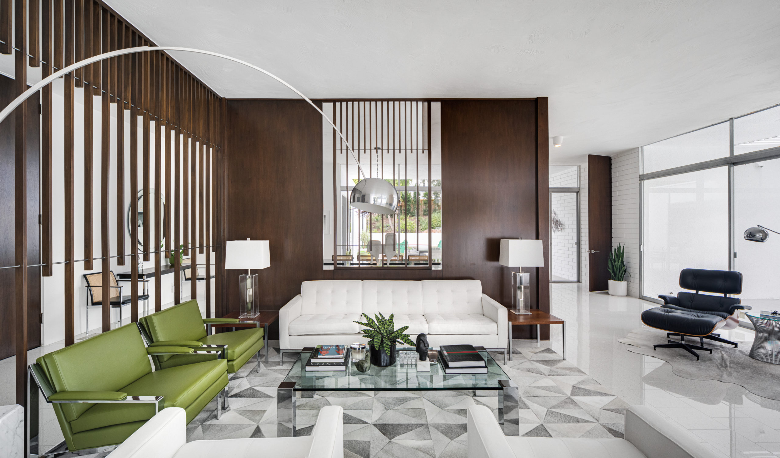
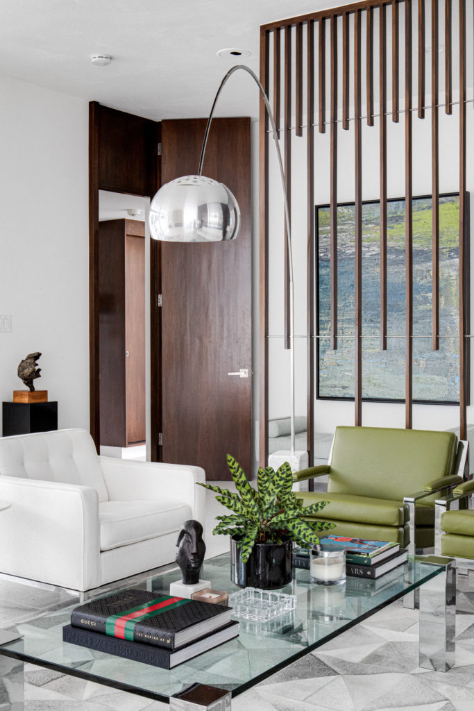
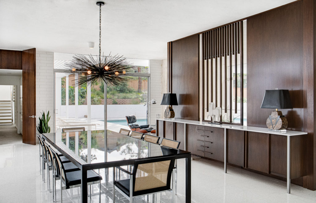
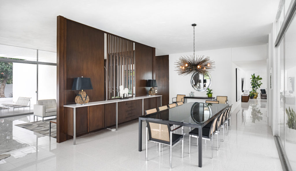
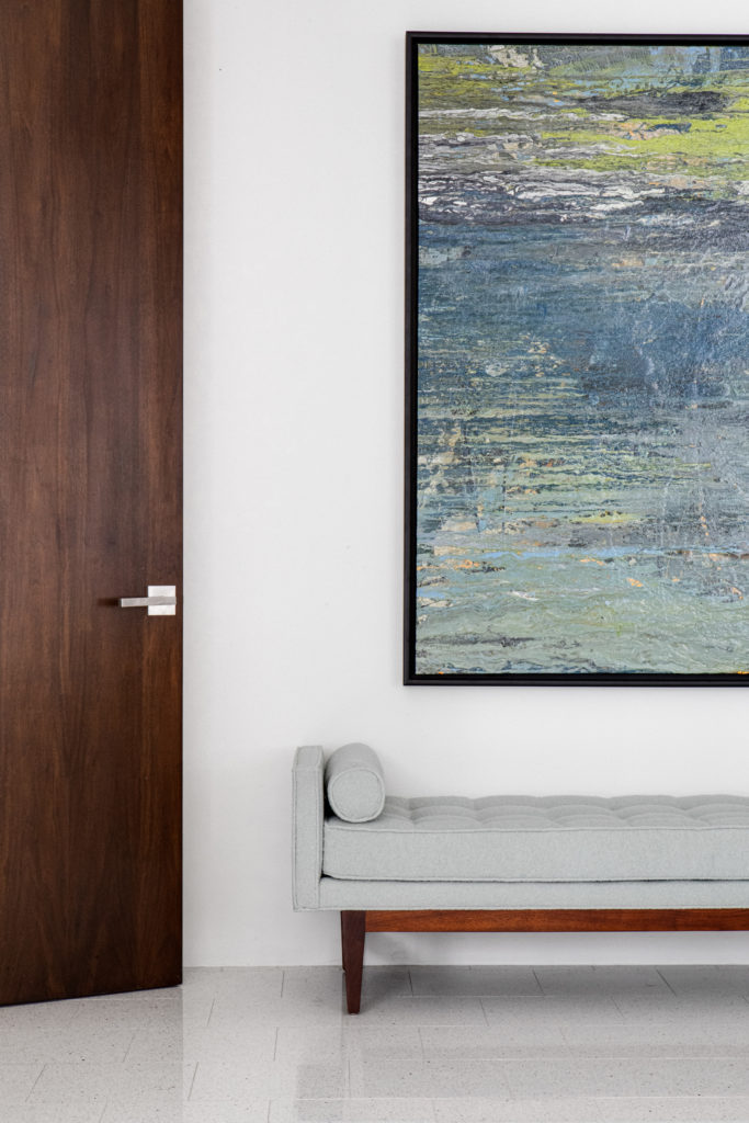
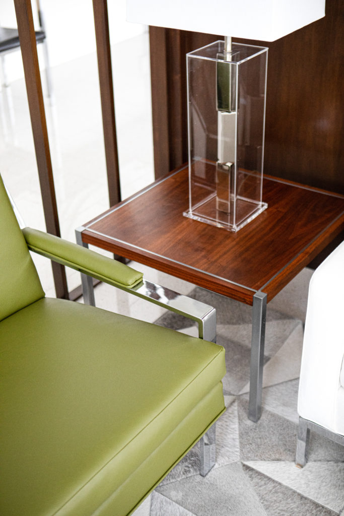
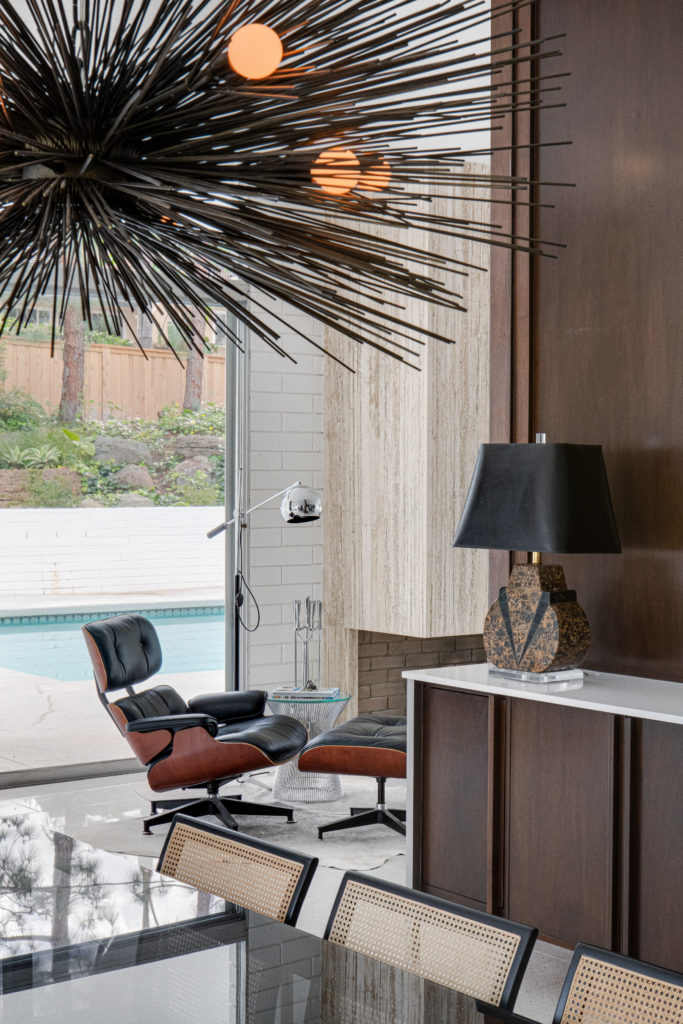
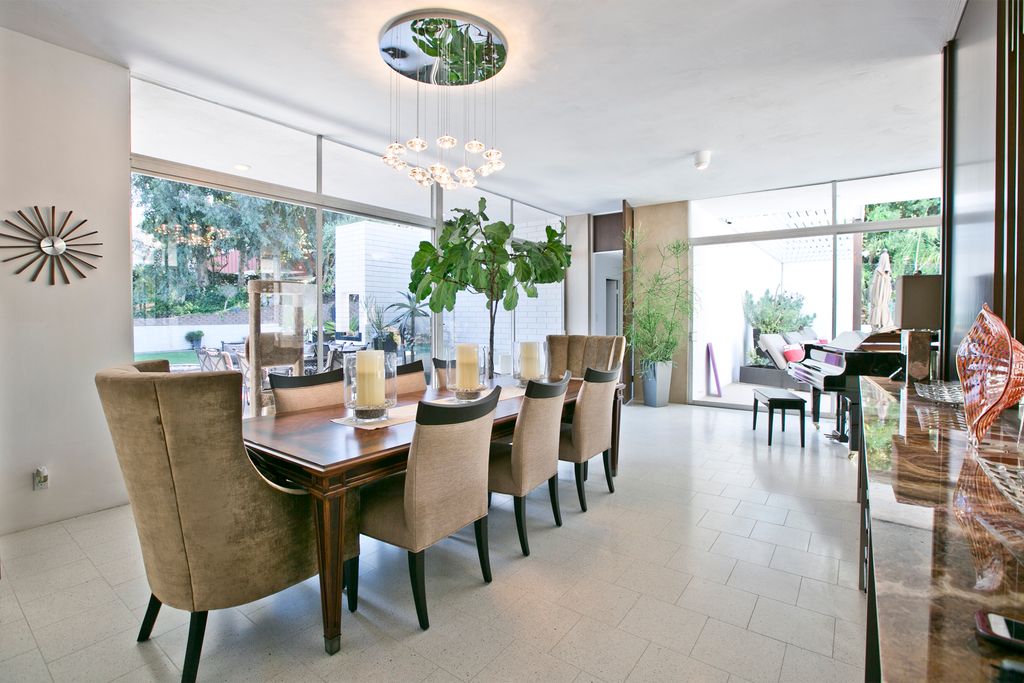
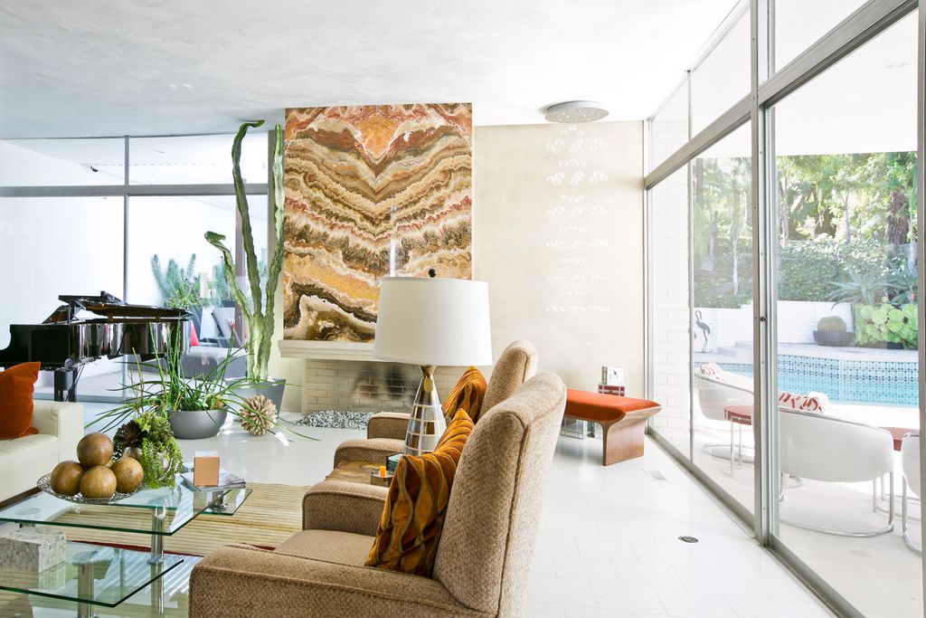
As you walk into the home one of the first things you notice is the beautiful terrazzo flooring that contrasts against the original wood room dividers. We love the contrast of the darker fixtures and dining table and chairs against the white floors and walls. The original Paul McCobb cabinetry, seen here, had been stained a darker color by a previous owner and the new owners plan on restoring them back to their original color. We worked with the new owners to come up with a solution that would compliment and not distract the eye. Above the dining table is a stunning chandelier by Jean de Merry. Opposite the formal dining space is a beautiful open lounge or sitting area which is furnished completely with vintage Knoll chairs, sofa, coffee table and lamps. All of the pieces were sourced by our team and meticulously restored with the client’s choice of green color palette which adds to the concept of indoor/outdoor living that is so important in this home. Carefully selected plants and vintage planters that were already part of the owners collection, are visible throughout the home and with the light filled spaces it is clear they are thriving in the filtered sunlight.
Less is MORE in a Mid Century Home
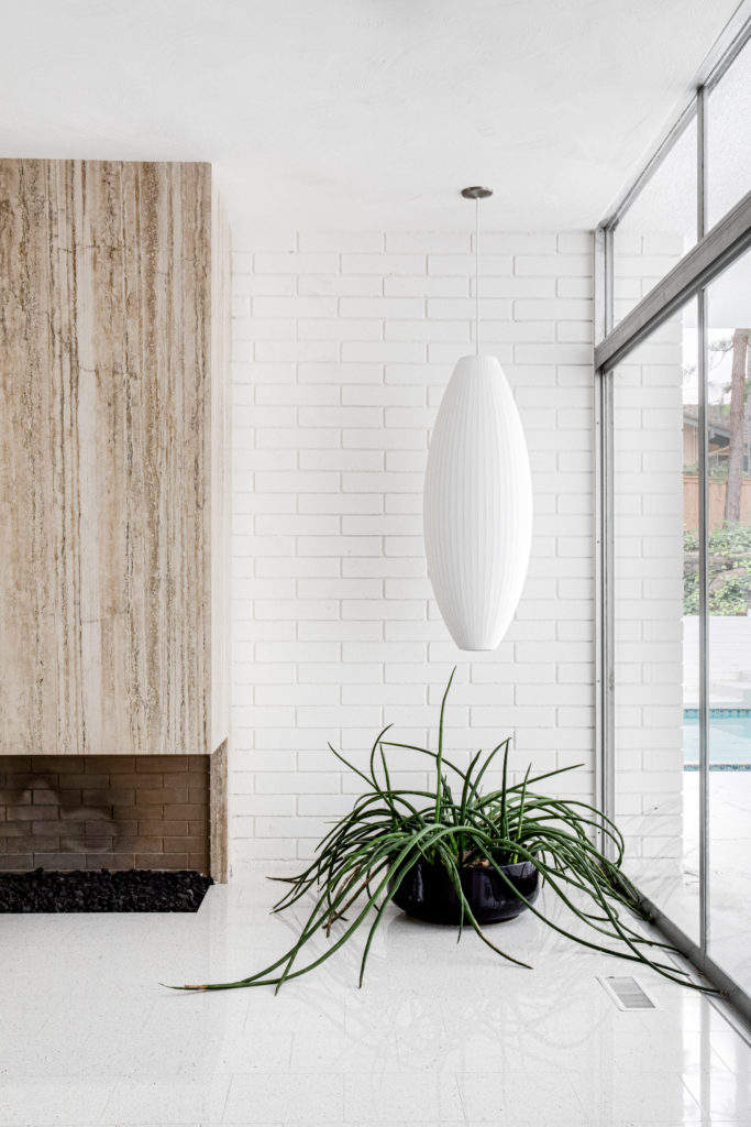
Original brick walls create a seamless flow from indoors to outdoors
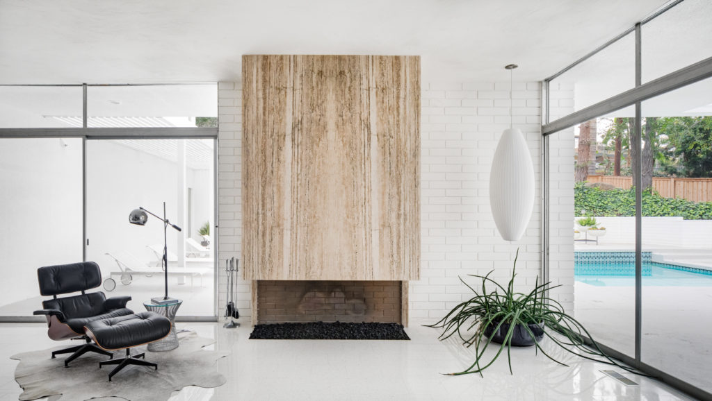
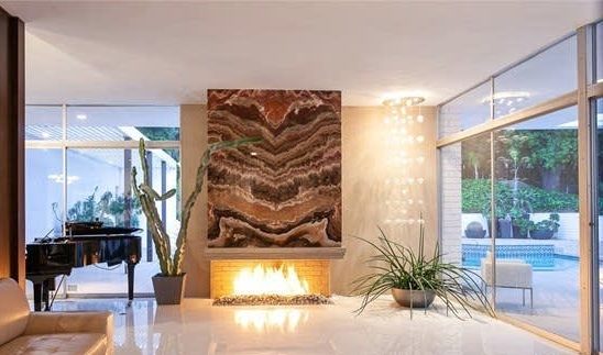
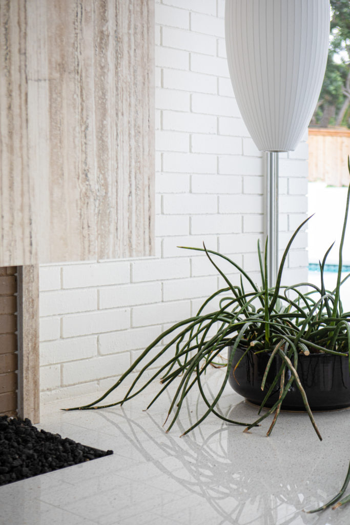
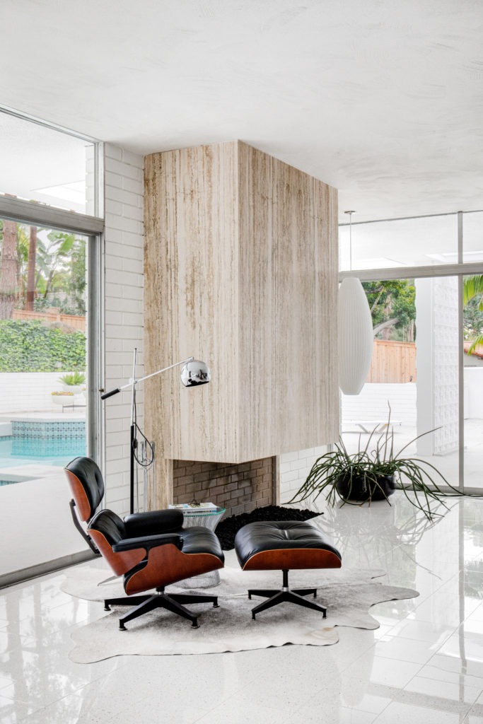
The previous owners covered up the beautiful flow of original brick from the fireplace to the adjacent outdoor sitting area. One of the first things the new owners absolutely had to remove was the old plaster covering the original brick walls, but it wasn’t without a bit of a push back from the contractor. Once the plaster came off easier than expected, it was clear to see why he was on board. This is one of the classic features of mid century modern design and it was lost with previous changes. Now that it is removed and the overbearing onyx fireplace facing was taken down, the home flows seamlessly with near invisible and all original windows and sliding glass doors that lead to the light filled outdoor lounge area. We sourced the new fireplace travertine from a local stone quarry and chose to tone down the color palette so your eye sees the beauty of the timeless architecture and not just ‘that fireplace’. Here are the before and after photos of this crucial part of the restoration. The classic extra large George Nelson Cigar Bubble Lamp highlights the corner and this mature succulent was left in the home when they moved in and they were happy to put it to use in the simple, yet elegant space.
Light-Filled Casual Living Areas
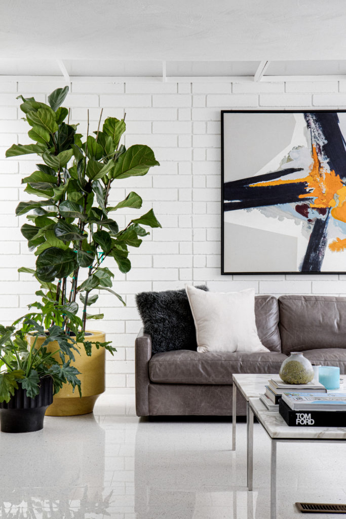
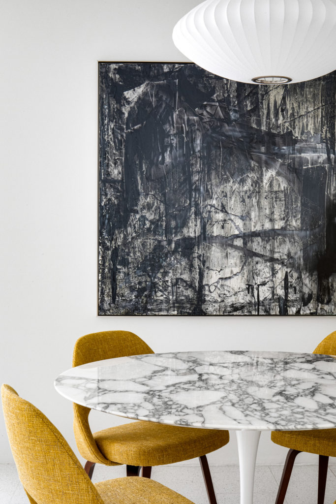
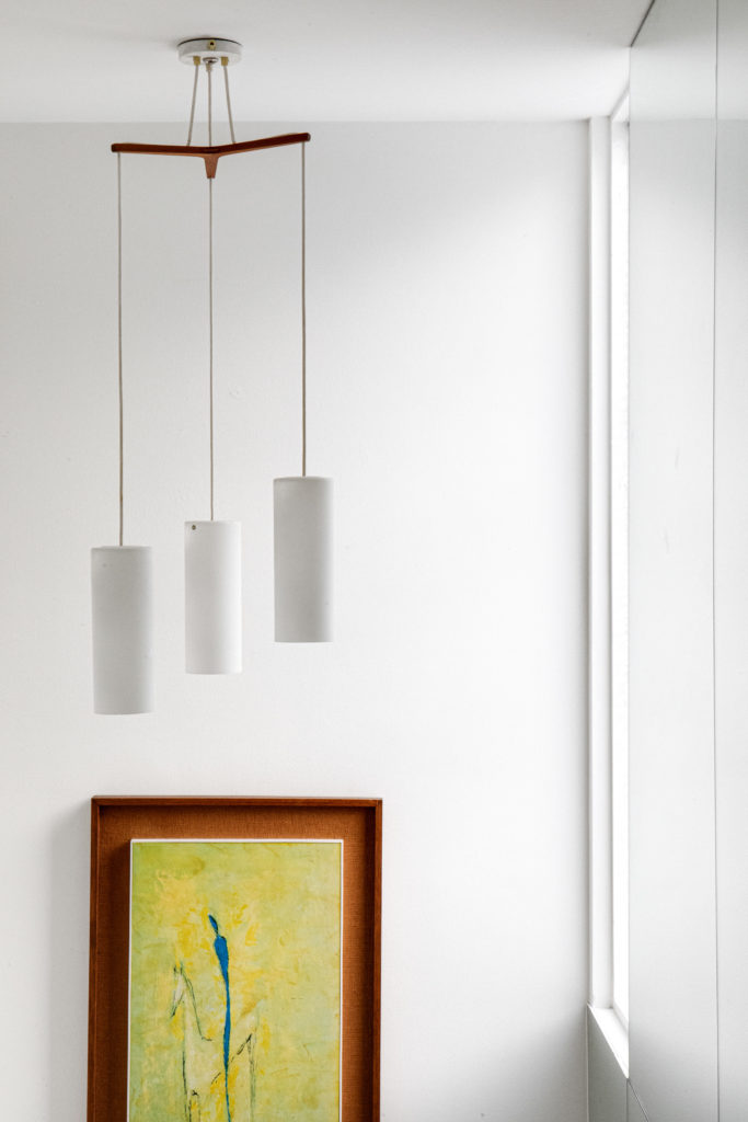
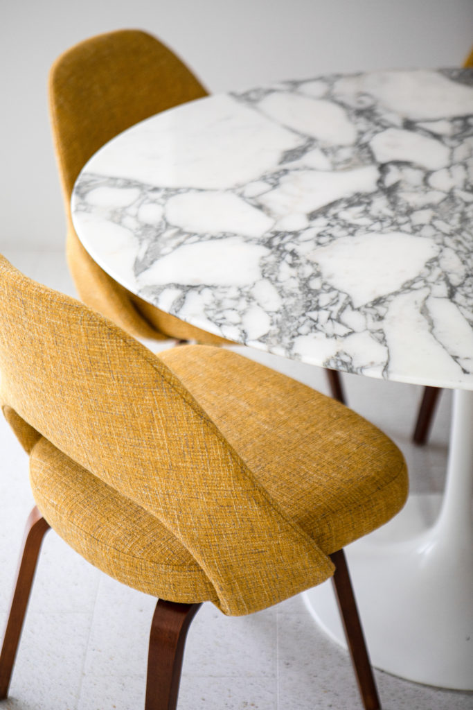
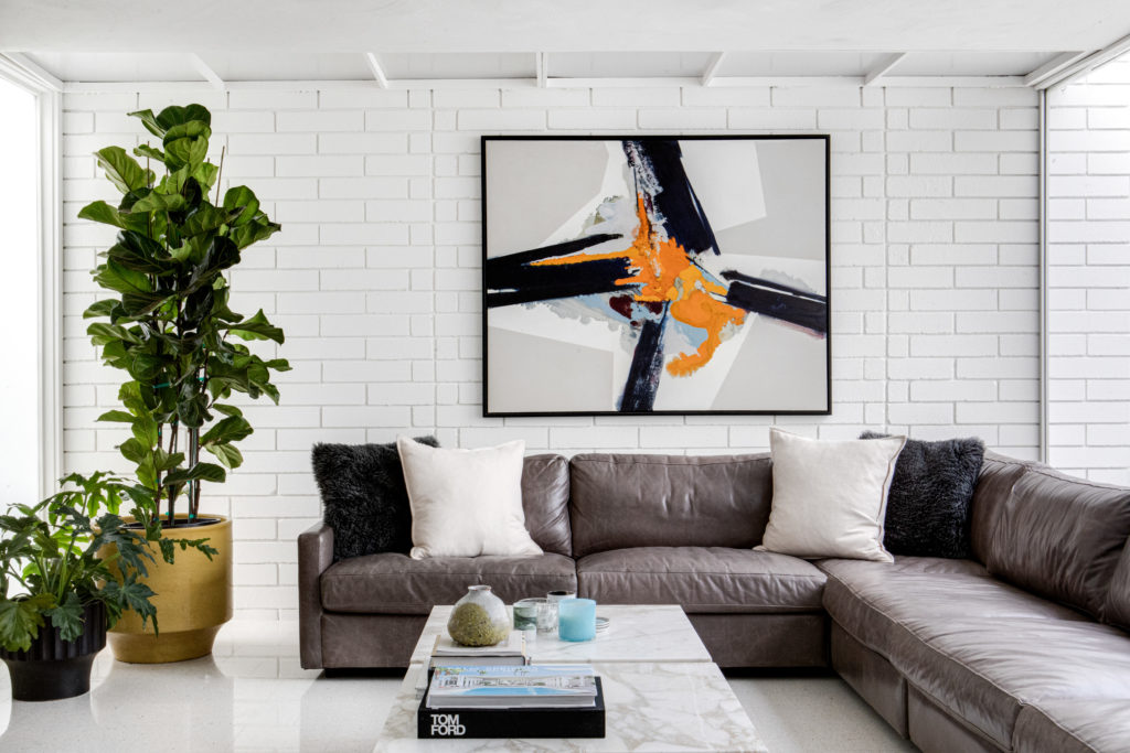
Here in the casual living area, we used the owners own grey leather sectional sofa and surrounded it with beautiful artwork, their own vintage pottery collection and marble top side tables that were joined together to create a usable large coffee table. This open space is where the couple spends the majority of their casual time with their two dogs and two cats. The light in this room is spectacular and is large enough for a small dining table nook. The table is a vintage original Eero Saarinen Marble top tulip table we found for them and the original Saarinen chairs were purchased at auction, restored and recovered in classic mustard tweed Knoll fabric. The colors and textures work so well together in this space that is adjacent to the kitchen with a very handy pass-through for serving and entertaining. The art above the sofa is also a vintage piece from our showroom and the black and white is a local artist, Brandon Charles Weber, who specializes in abstract modern. The glass three light chandelier hanging in the hallway leading upstairs is a Danish design by Uno & Östen Kristiansson for Luxus, circa 1960. Paired with a vintage Spanish abstract, the tones fit perfectly in the light-filled staircase.
It’s the little things that matter…
Seamless Transition Between Indoor and Outdoor Spaces Define The Home
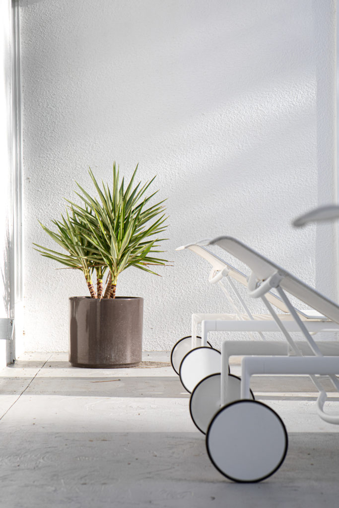
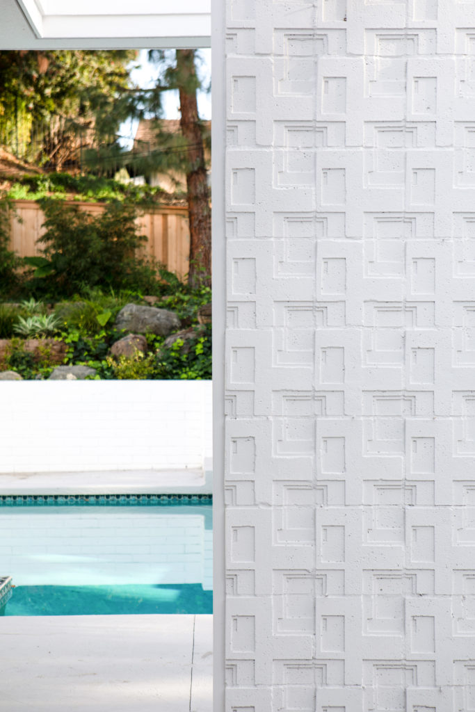
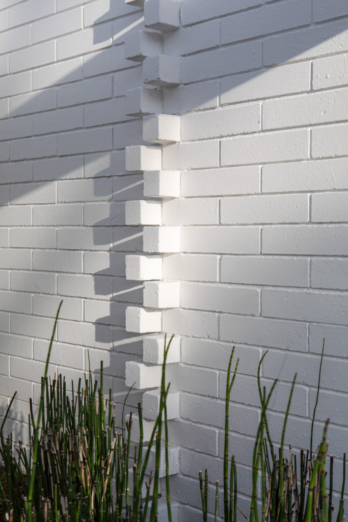
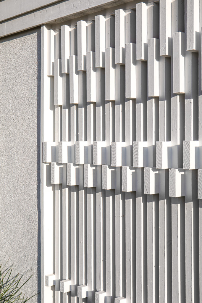
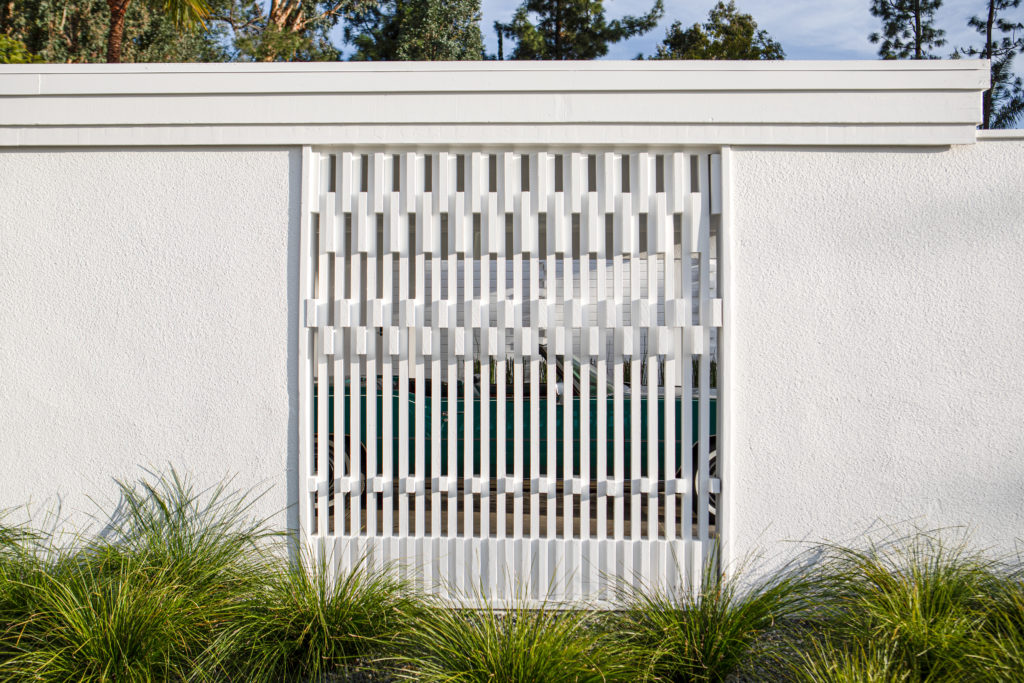
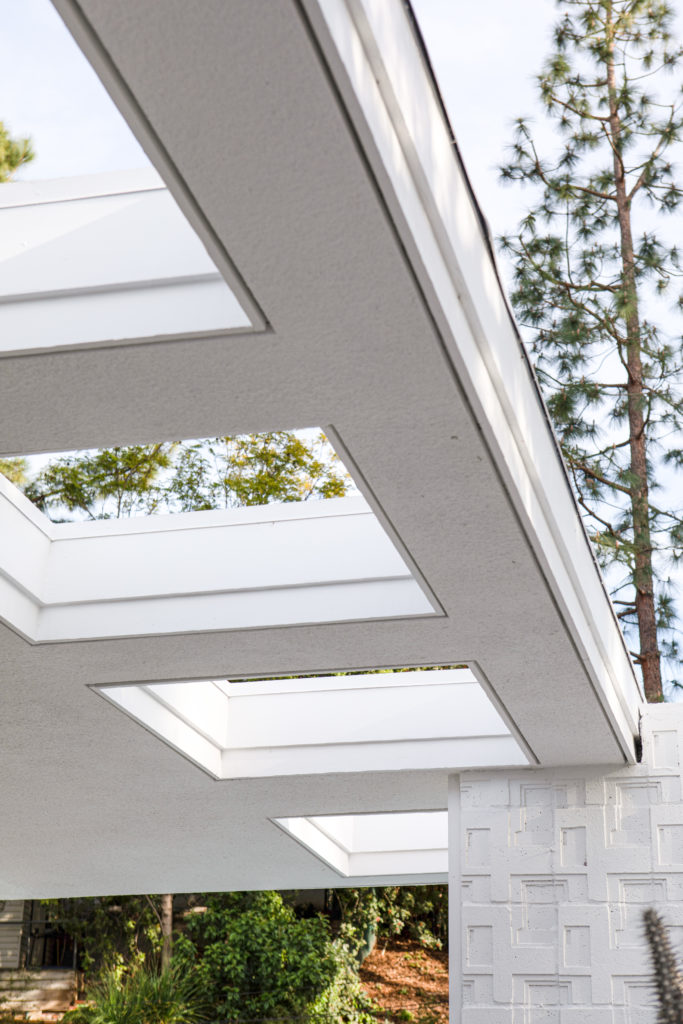
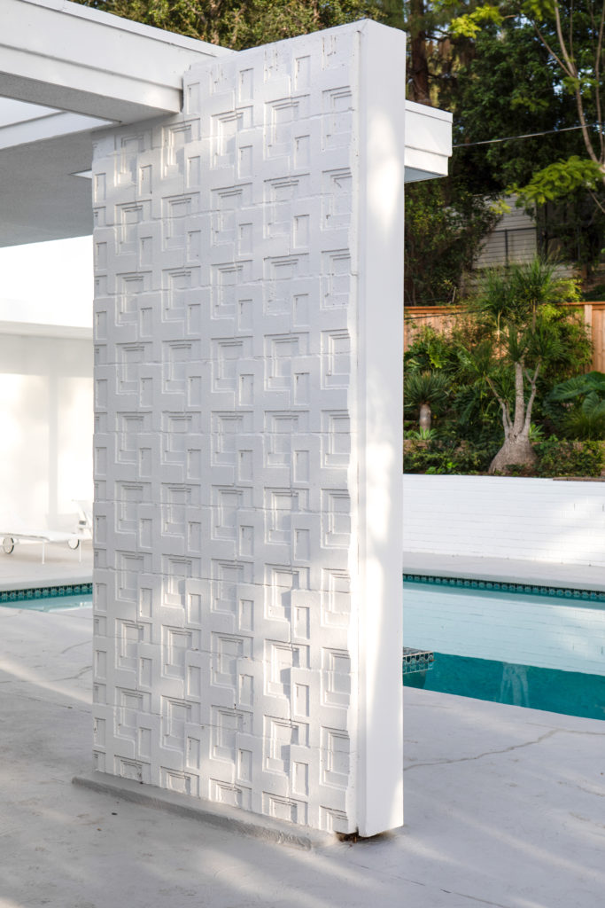
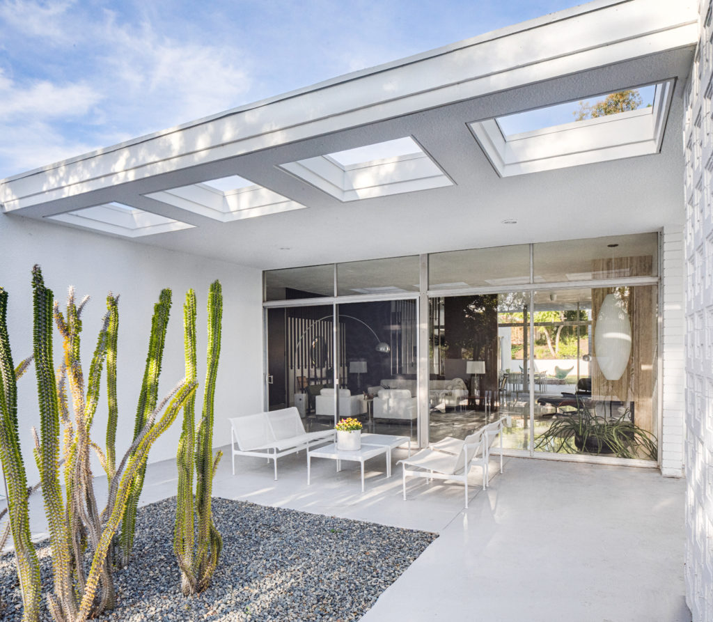
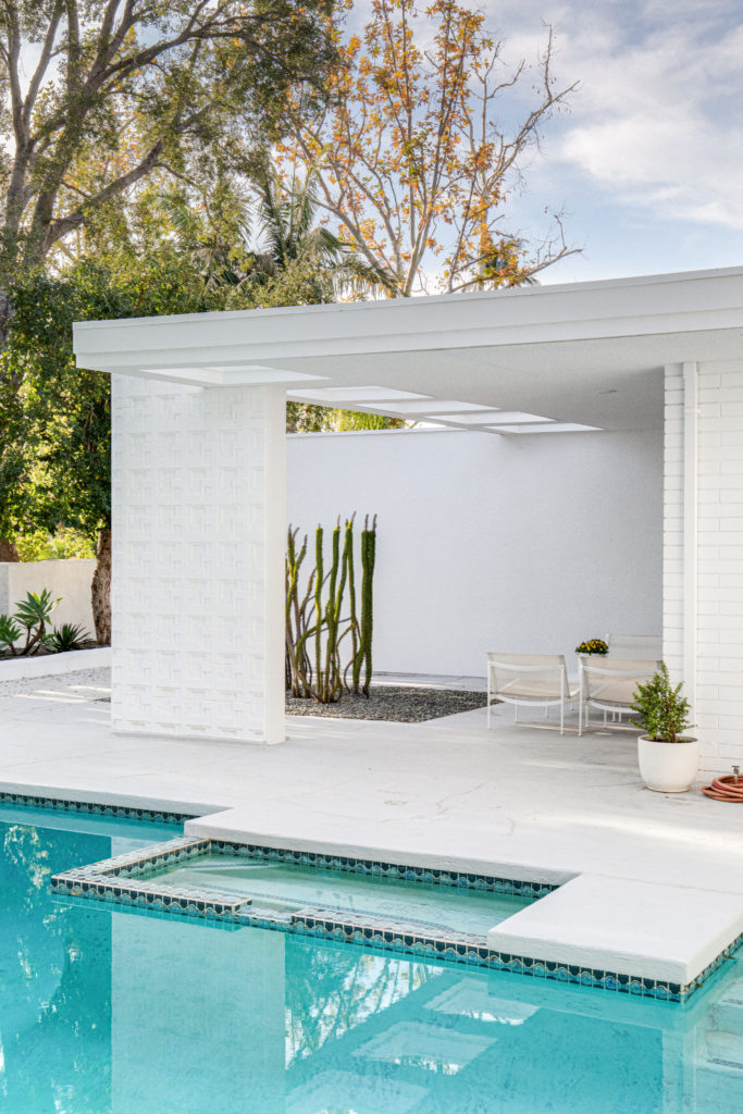
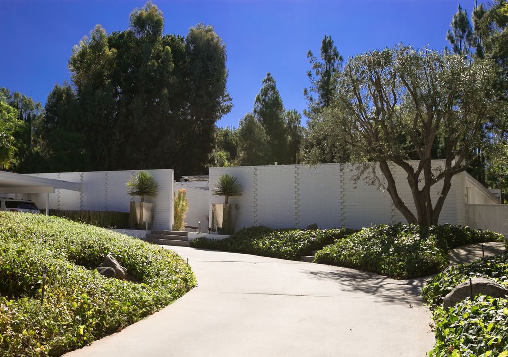
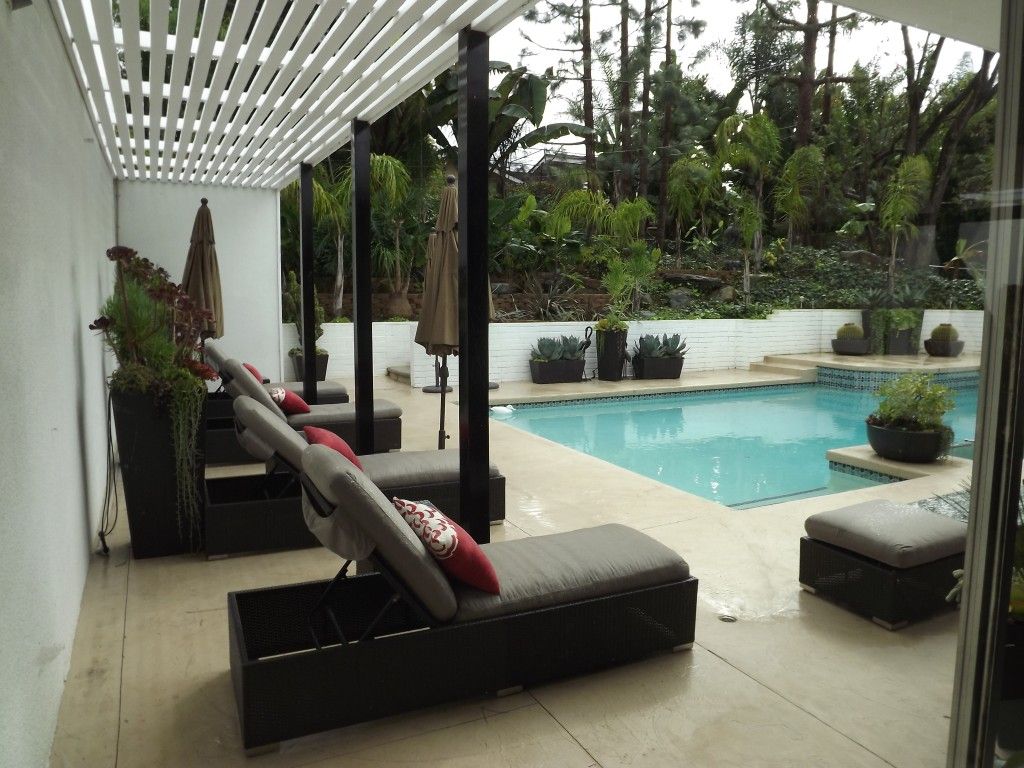
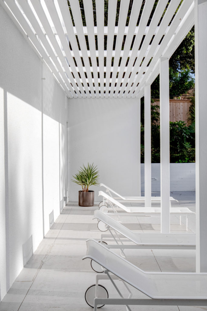
One of the features of the architect’s design and a common theme in mid century modern architecture is the seamless flow between indoor and outdoor spaces. It is evidently clear in this home and with the temperate Southern California climate, the home lends itself to just that type of living. Furnished outside with vintage Richard Schultz patio furnishings, they look as if they should have been there all along. The owners love Schultz designs and have amassed quite a collection even before purchasing the home. It feels like the furniture was specifically designed for this home and has been there since the 1960’s. Slatted open rooflines cast amazing shadows and definition and change the feel at different times of the day. The architectural details in the brickwork at the front of the home and the concrete block panel that separates the outdoor lounge area and the pool are an original and important part of the home. Other than a fresh coat of paint, they are virtually untouched from the original design.
Before and Afters….
Grab a seat, you’re gonna need it
There is so much more we want to show you, but you will be able to get a glimpse of this fabulous home in print soon! Watch for this stunning home in an upcoming issue of Atomic Ranch Magazine, where it will be featured on both Interior and Special Editions. We can’t thank Casey and Thomas enough for trusting us with their dream and making it come true.
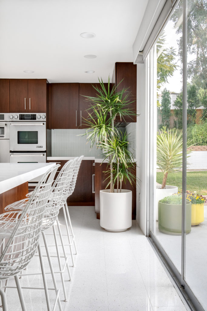
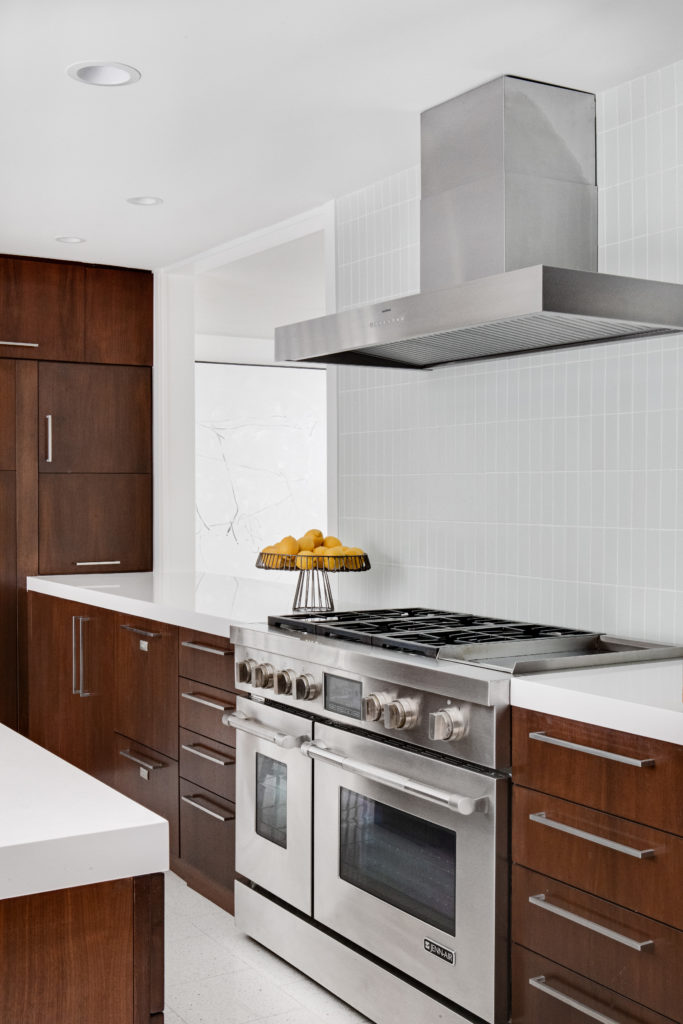
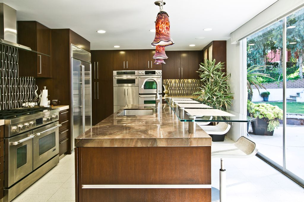
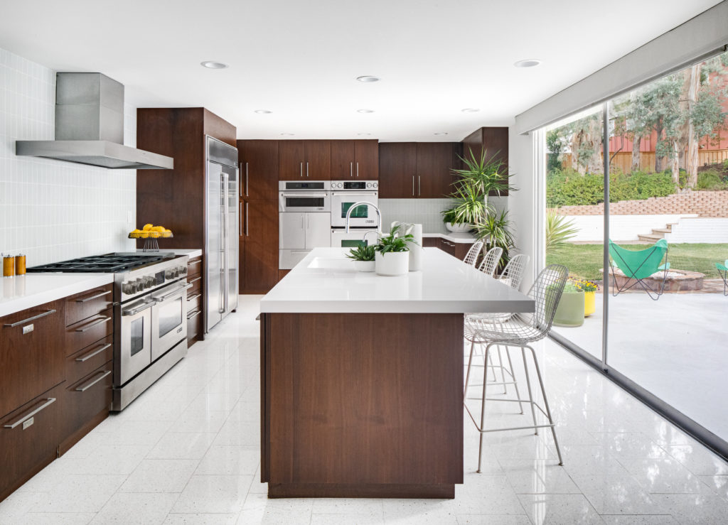
Casey and Thomas still have a few ideas up their sleeve and we still plan to restore the kitchen closer to the original design which had beautiful floating cabinetry, restore the bathrooms and pool, and some of the outdoor living spaces. Overall, we are thrilled with the result and the clients are very happy. Follow their Instagram feed here @philmerjellerbroek. They have had several requests for an open house, so watch their social media page for more information. More photos are available on request and we have to give a huge shout out to Chad Mellon who is the photographer on this project. His work is absolutely stunning!
“Thank you Shelly and Lisa, we couldn’t have done it without you, and we are not finished yet!”
Casey Lesher and Thomas Fountain, Owners

